Stories That Matter: A Designer's Playbook for Transforming Wireframes into Polished Product Interfaces
Balancing brand identity, accessibility, and measurable user engagement in modern UI design
Every great product interface begins with a story—a narrative that connects user needs with business goals, aesthetic vision with functional reality. As designers, we're not just pushing pixels or arranging components; we're crafting experiences that resonate, engage, and ultimately drive meaningful outcomes. The journey from rough wireframe sketches to polished, production-ready interfaces is both an art and a science, requiring equal parts creativity, strategic thinking, and technical precision.
Chapter 1: The Foundation—Understanding Your Design Story
Before diving into high-fidelity mockups, successful designers invest time in understanding the narrative architecture of their product. This means asking fundamental questions that shape every subsequent design decision:
- → Who is the protagonist? Define your user personas with depth—their goals, pain points, technical literacy, and emotional drivers.
- → What's the conflict? Identify the core problem your interface solves and the friction points it eliminates.
- → What's the resolution? Clarify the desired outcome—both for users and the business.
- → What's the emotional arc? Map the user's emotional journey from first interaction to goal completion.
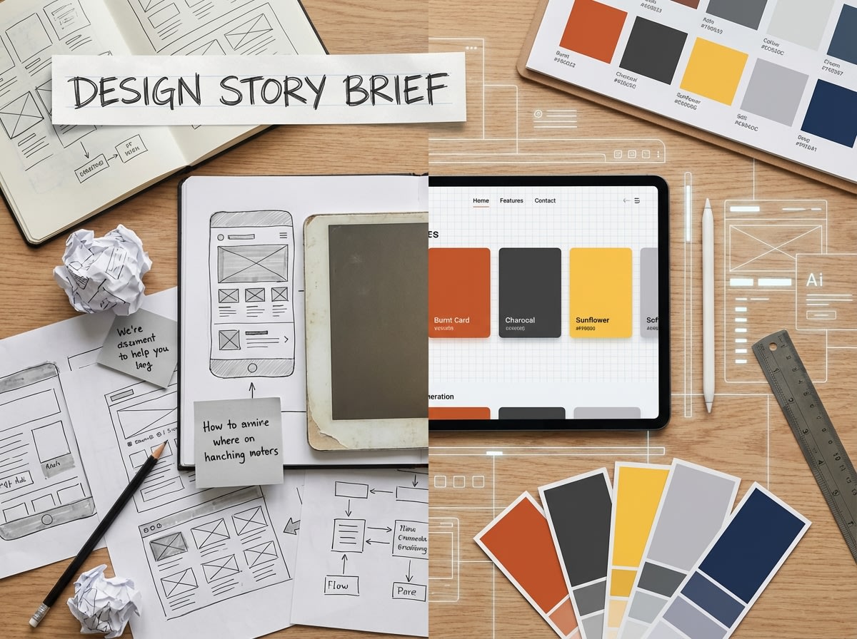
Pro Tip: Create a one-page "Design Story Brief" that captures these elements. Reference it throughout the design process to ensure every decision serves the narrative.
Chapter 2: From Sketch to Structure—The Wireframe Evolution
Wireframes are the skeletal framework of your design story. They establish information hierarchy, user flow, and functional relationships without the distraction of visual polish. However, the transition from wireframe to high-fidelity design is where many projects stumble.
The Three-Phase Wireframe Approach
Phase 1: Low-Fidelity Sketches (Paper or Digital)
Focus on rapid ideation and exploring multiple layout concepts. Don't commit to details—explore possibilities. Use simple boxes, lines, and annotations to capture ideas quickly.
Key Activities: User flow mapping, content prioritization, interaction patterns exploration
Phase 2: Mid-Fidelity Wireframes
Introduce structural precision with actual content dimensions, spacing systems, and component relationships. This is where you establish your grid system and responsive behavior.
Key Activities: Grid definition, component library foundation, responsive breakpoint planning
Phase 3: Annotated Wireframes
Add interaction specifications, micro-interaction notes, accessibility requirements, and edge case documentation. This becomes your blueprint for high-fidelity design.
Key Activities: Interaction documentation, accessibility annotations, developer handoff preparation
Chapter 3: Brand Integration—Making It Unmistakably Yours
A polished interface doesn't just function well—it embodies brand personality in every pixel. This is where your design story becomes uniquely yours, differentiated from competitors and memorable to users.
The Brand Expression Framework
- Visual Language System: Develop a cohesive color palette (like the strategic use of #d64537, #fbbf24, and #0f172a), typography hierarchy, iconography style, and spacing rhythm that reflects brand values.
- Interaction Personality: Define how your interface moves and responds. Are transitions quick and efficient or smooth and elegant? Do buttons provide satisfying feedback? These micro-interactions communicate brand character.
- Content Voice: Ensure UI copy, error messages, and microcopy align with brand tone. A playful brand shouldn't have sterile error messages; a professional platform shouldn't use overly casual language.
- Consistency Across Touchpoints: Your interface should feel like a natural extension of your marketing site, mobile app, and other brand touchpoints. Create a design system that scales across platforms.
Real-World Example: When designing a fintech dashboard, we used #d64537 exclusively for critical alerts and destructive actions, establishing a clear visual language that users learned to recognize instantly. Positive actions used #fbbf24, creating an intuitive color-coded system that reduced user errors by 34%.
Chapter 4: Accessibility—Designing for Everyone
Accessibility isn't a feature—it's a fundamental design principle that ensures your story reaches the widest possible audience. A truly polished interface is one that everyone can use, regardless of ability.
The Accessibility Checklist for Polished Interfaces
- ✓Color Contrast: Ensure text meets WCAG AA standards (4.5:1 for normal text, 3:1 for large text). Test your palette combinations rigorously.
- ✓Keyboard Navigation: Every interactive element must be reachable and operable via keyboard. Implement clear focus indicators.
- ✓Screen Reader Compatibility: Use semantic HTML, proper ARIA labels, and descriptive alt text for images. Test with actual screen readers.
- ✓Responsive Text Sizing: Support browser zoom up to 200% without breaking layout. Use relative units (rem, em) instead of fixed pixels.
- ✓Motion Sensitivity: Respect prefers-reduced-motion settings. Provide alternatives to auto-playing animations.
- ✓Error Prevention & Recovery: Provide clear error messages, validation feedback, and easy ways to correct mistakes.
Remember: Accessible design is often better design for everyone. Clear visual hierarchy helps all users. Keyboard shortcuts benefit power users. Captions help people in noisy environments. Design inclusively from the start, not as an afterthought.
Chapter 5: Measuring Success—User Engagement Metrics That Matter
A polished interface isn't just beautiful—it's measurably effective. The final chapter of your design story is written in data, user feedback, and business outcomes.
Key Metrics for Interface Success
Task Completion Rate
The percentage of users who successfully complete primary tasks. Target: >90% for critical flows.
Time on Task
How long it takes users to complete actions. Faster isn't always better—measure against baseline and user expectations.
Error Rate
Frequency of user mistakes, form validation errors, or incorrect actions. Lower is always better.
User Satisfaction (SUS/NPS)
Subjective user ratings using standardized scales. Combine quantitative metrics with qualitative feedback.
Continuous Improvement Framework
Polished interfaces aren't static—they evolve based on real-world usage:
- Establish Baselines: Measure current performance before launching redesigns.
- Implement Analytics: Use tools like Hotjar, Mixpanel, or Google Analytics to track user behavior.
- Conduct Regular Usability Testing: Test with real users quarterly, not just at launch.
- A/B Test Hypotheses: When data suggests problems, test solutions systematically.
- Iterate Based on Evidence: Let data guide design decisions, but don't ignore qualitative insights.
The Designer's Mantra
"Great interfaces tell stories that users want to be part of. They balance beauty with function, brand with accessibility, and creativity with measurable results. The journey from wireframe to polished product is where design magic happens—where sketches become experiences that truly matter."
Conclusion: Your Design Story Starts Now
Transforming wireframe sketches into polished product interfaces is a journey that requires strategic thinking, creative vision, technical skill, and empathy for users. By following this playbook—understanding your design narrative, evolving wireframes systematically, integrating brand authentically, prioritizing accessibility, and measuring success rigorously—you'll create interfaces that don't just look good, but perform exceptionally.
The stories that matter most are the ones that connect with real people, solve real problems, and create real value. Your next design project is an opportunity to tell one of those stories. Make it count.
Ready to transform your wireframes into polished interfaces? Explore more design insights and resources on our blog, or get in touch to discuss your next project.