The Cozy Planter: A Cottagecore Guide to Garden Nooks
Design-forward tips for creating enchanting planting spaces with soft greens, earthy textures, and timeless style
There's something undeniably magical about a well-curated planting nook—a space where nature meets intention, where soft greens whisper tranquility, and where every element feels like it belongs. Welcome to the world of cottagecore-inspired garden design, where we blend the rustic charm of countryside living with modern design sensibilities to create spaces that nurture both plants and souls.
Whether you're styling a corner of your balcony, a backyard garden shed, or even your online gardening presence, this guide will help you cultivate that cozy, lived-in aesthetic that makes cottagecore so irresistible.
Embracing the Cottagecore Color Palette
The foundation of any cottagecore-inspired space begins with color. Think of the palette as your garden's emotional landscape—soft, welcoming, and deeply connected to nature.
Your Essential Cottagecore Colors
- 🌿 Sage Green (#7A9E5E) – The hero of your palette, this muted green evokes herb gardens and morning dew. Use it for primary accents, planters, and focal points.
- 🍂 Terracotta (#C98B4A) – Warm and earthy, this clay-inspired hue brings depth and grounding energy. Perfect for pottery, wooden accents, and text highlights.
- 🌾 Moss Green (#A3B18A) – A softer, dusty green that adds layers and sophistication. Ideal for backgrounds and secondary elements.
- ☁️ Cream (#F5F1E8) – Your neutral base that lets other colors breathe. Use generously for backgrounds, labels, and breathing room.
- 🌑 Forest Dark (#2F3A2E) – A deep, grounding shade for text and dramatic contrast. Use sparingly for maximum impact.
Design Tip: When styling your physical garden nook or digital presence, aim for a 60-30-10 rule: 60% cream and soft neutrals, 30% sage and moss greens, and 10% terracotta accents. This creates visual harmony without overwhelming the senses.
Curating Earthy Textures & Materials
Cottagecore is as much about touch as it is about sight. The textures you choose tell a story of authenticity, craftsmanship, and connection to the earth.
Essential Texture Elements
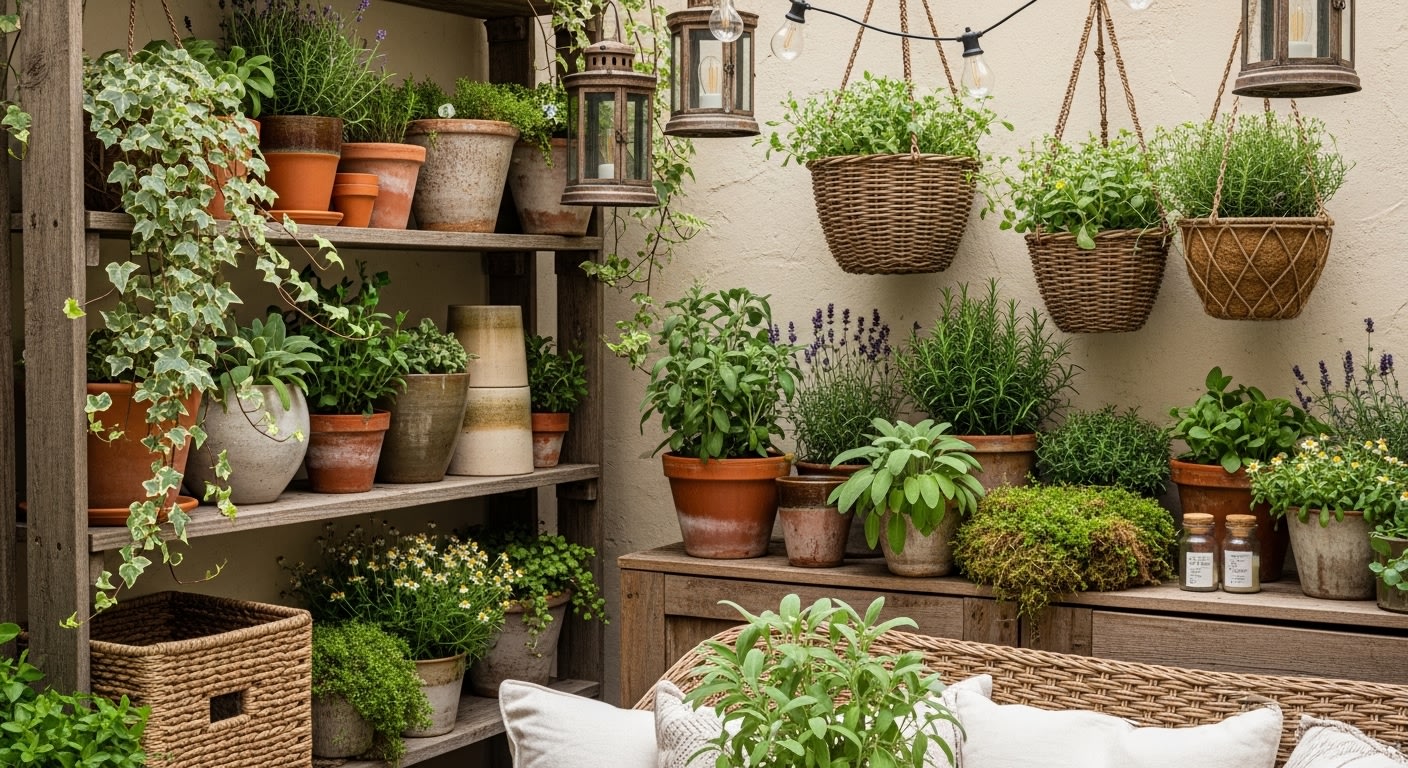
Natural Wood: Weathered wooden crates, reclaimed shelving, and driftwood pieces add warmth and rustic charm. Look for pieces with visible grain and imperfections—they tell the best stories.
Terracotta & Clay: Unglazed pots, ceramic vessels, and handmade pottery bring that quintessential cottage garden feel. Their porous nature is also excellent for plant health.
Woven Elements: Wicker baskets, jute twine, and macramé plant hangers introduce soft, organic patterns that complement rather than compete with your greenery.
Linen & Cotton: For cushions, plant covers, or even as backdrop materials, natural fabrics in cream and sage tones add softness and livability to your space.
When arranging your planting nook, layer textures intentionally. Place a smooth ceramic pot on a rough wooden shelf, drape soft linen near woven baskets, and let trailing plants soften hard edges. This creates visual interest and that "collected over time" aesthetic that defines cottagecore.
Typography & Visual Identity for Your Garden Brand
If you're extending your cottagecore aesthetic to an online presence—whether that's a gardening blog, Instagram feed, or plant shop—typography becomes your voice in visual form.
Choosing the Right Fonts
Cottagecore typography should feel timeless, readable, and slightly romantic. Here's how to build your type system:
- Headlines: Choose serif fonts with personality—think Georgia, Lora, or Playfair Display. These evoke classic book typography and garden journals.
- Body Text: Opt for clean, readable sans-serifs or gentle serifs like Crimson Text or Source Serif Pro. Readability is key for longer content.
- Accents: A handwritten or script font (used sparingly!) can add charm to labels, quotes, or special callouts. Try Amatic SC or Dancing Script.
Typography Best Practices
- Keep font pairings to 2-3 maximum
- Use generous line spacing (1.6-1.8) for a breathable, relaxed feel
- Stick to your color palette—sage green for headings, forest dark for body text
- Add subtle letter-spacing to uppercase text for elegance
- Ensure strong contrast between text and background for accessibility
Styling Your Physical Garden Nook
Now let's bring it all together in your actual garden space. Here's how to create a planting nook that embodies cottagecore charm:
Step-by-Step Nook Creation
1. Choose Your Corner
Select a spot with good natural light but not harsh direct sun all day. A corner of a patio, a window ledge, or a sheltered garden wall works beautifully.
2. Layer Your Surfaces
Start with a wooden shelf or vintage table as your base. Add a woven mat or piece of linen underneath pots for texture and protection.
3. Select Your Plants Thoughtfully
Choose plants with soft, romantic foliage: herbs like lavender and rosemary, trailing ivy, ferns, and flowering plants in whites and soft pinks. Vary heights for visual interest.
4. Add Functional Decor
Include vintage watering cans, garden tools with wooden handles, handwritten plant labels, and small decorative items like stones or dried flowers.
5. Create Cozy Lighting
String lights, lanterns, or candles in glass holders add warmth for evening enjoyment. Choose warm white bulbs over cool tones.
Translating Your Style Online
Your digital presence should mirror the warmth and intentionality of your physical space. Here's how to maintain cottagecore aesthetics across platforms:
- Photography: Use natural lighting, soft focus, and overhead or eye-level angles. Include hands in shots for a personal, lived-in feel.
- Graphics: Design with your color palette consistently. Use cream backgrounds with sage green text and terracotta accents.
- Content Tone: Write warmly and personally, as if sharing garden wisdom with a friend over tea. Use storytelling and sensory details.
- Layout: Embrace white space (or cream space!). Don't overcrowd—let your content breathe like a well-planned garden.
Your Cozy Planter Journey Begins
Creating a cottagecore-inspired planting nook is about more than aesthetics—it's about crafting a sanctuary where you can slow down, connect with nature, and find joy in simple, beautiful things. Whether you're arranging terracotta pots on a wooden shelf or designing your garden blog's homepage, let these principles of soft greens, earthy textures, and thoughtful typography guide you toward a space that feels authentically you.
Remember: cottagecore isn't about perfection. It's about intention, warmth, and the beauty of things that grow—both in your garden and in your creative expression. Start small, experiment with your palette, and let your nook evolve naturally over time.
Happy planting, and may your nook be ever cozy. 🌿